


I just wrote about saying “no.” Sadly sometimes people put you in a situation where you can’t say “no.” You get the “Oh you’re SO good at this” or “I knew you could help out.” Most of these requests come from friends or family and most come with no actual compensation. Just a chance to feel good about spending hours helping someone out. Isn’t that enough? (umm…) I was a teacher I know all about spending hours and hours and not getting properly compensated “for the kids.” This time around I’m desgining pathtags and other things for a geocaching event. I already wrote a bit about this earlier, but figured I’d catch people up now that almost everything I’ve currently designed has gone into production.
This project started out with Sue being an advocate for real artists and not AI. She had been asked to be on a committee for a GeoTour in Southernish Indiana. They already had someone who was a pathtag designer onboard, so I wouldn’t be needed. With in 48 hours, I was now the lead (only) designer. Along with that I was to go to between the company making the pathtags and the person in charge of the GeoTour. I had “experience”… I knew the vocabulary. My actual scope of work? Take sponsors logos and turn them into a pathtag.
What’s a Pathtag?
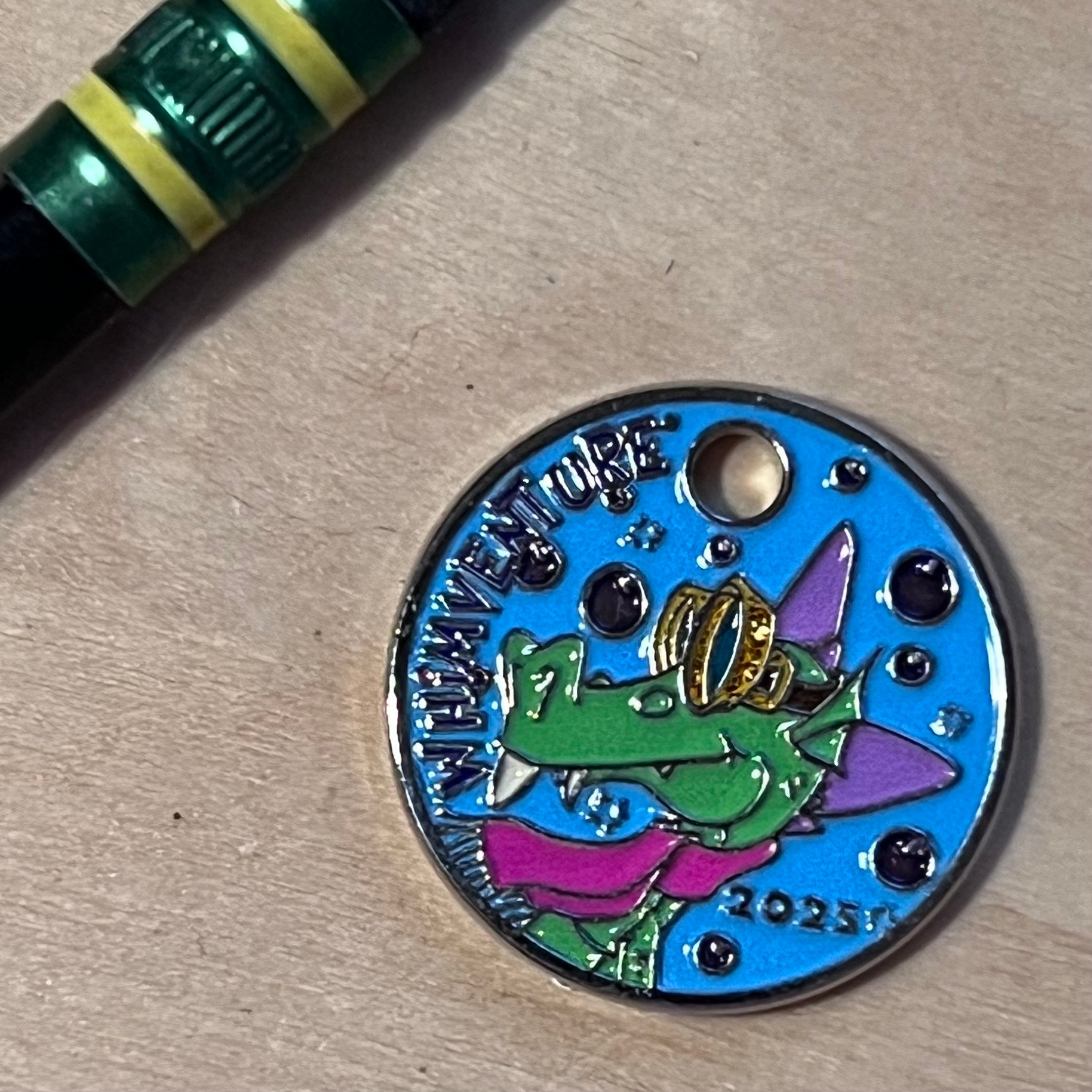
A pathtag is a metal coin about the size of an American five cent piece, it has a hole in it so it can be hung off f something. The original purpose was as a signature item for geocachers to place into a cache. “Who have you crossed paths with?” they were collectible and tradable. I made my first one in 2007, and dove into it (like I always do) for a while. When I took a break from geocaching it also took a break from pathtags. Due to the beautiful tariffs the company pivoted with a product called “Flashtags” which were easier to make, but didn’t have a hole and were pretty much a graphic file suck on a metal blank. Not as long lasting or nice as a path tag. Until this project I’d designed somewhere around 30, and tried out a Flashtag.
The design process is pretty straight forward. The design needs to have raised metal spaces to hold enamel paint. Therefore you can lose detail. Making the detail either metal (therefore sticking up) or the background metal (so the detail is cut in) does make things easier. Not all designs allow for this. Once you think you have a design finished- it gets sent to blueprinting. This is where the factory takes your design and makes it possible for it to become a pathtag. Lines too thin? Too much detail? Too many colors? All are issues. You want glitter, glow-in-the dark, or translucent? They have restrictions also. What about textured metal? Again warnings and restrictions will pop up.
Find the Fun and… “SNAP!” The Job’s a Game!
My job… Yes, still a job, take a photo or low res image of a companies sign/logo that has been texted to me and turn it into a Pathtag. Most of the time I would go online search out the company and find a higher-res image or the logo that they currently use in Social Media and convert it to a viable design. Some sponsors provided their own design which was usually awful and wouldn’t work. I believe I commented on how much AI slop was being used in what is supposed to be an Arts Community- most of it won’t translate properly to a Pathtag, although I’m sure I could just pop it into some AI engine and have something perfect… ugh.
I do enjoy the challenge, so far I’m 14 designs into the project with a few being “gold sponsors” those get gold path tags. A few dealing with glow, or translucent, that was usually my call. I created a simple template with the “BROWN COUNTY BACKROADS GEOTOUR” along the bottom edge. This was moved and slightly resized in a few cases. when completed with the design I would add Pantone® numbers to help guide which colors I was wanting.
To compare- here is what I turned into blueprinting, and here’s what blueprinting gave back to me.


This design I took their logo and simplified as much as I felt I could, but the blueprinting process took it a step further (I’m still learning) in this case they changed the font bolder and to sans serif to make it so the paint could fill, and took “Boutique” and made it raised metal.


This one was all me! but also taught me some of the limitations, like limited color palette and channel width. I actually took their rejected blueprint and modified it to get it to work.
As few I had to turn down and make either changes in writing or major design changes. I learned that 8 colors is pretty much the maximum after sending in a couple designs with more than eight colors and getting them returned with fewer colors.


This one was interesting in that I was trying for texture on the lunar surface. My initial idea was to put a translucent yellow over it, but decided that the would be too much. As you can see I got limited to two textures, and even got a warning email about how this doesn’t always look the way you want it to. I’m still waiting for the tag to arrive, but I think I made sure the textures are different enough it should look pretty cool. The sponsor also wanted part to glow so the lettering glows.


Being a “Gold Sponsor” I thought this would be tastefully simple in mostly gold. The sponsor initially wanted the pathtag to be completely orange. Having to put a channel around the colors, I felt that the design would end up getting lost. Also being handed a gold coin is really cool.


Lots of cleaning up needed to be done on this one, mostly the design has lots of computer aided color shifts, which were pretty much impossible for a pathtag. As you can see a sans serif was used to replace the font in the logo to increase legibility.


This one I had only been given the logo- so the words. Like with most of the designs I took to the webs and did a search to see what else might be out there as an image. in this case their social media avatar was this really cool tree design. I figured I’d see about a mash up of the two.
I’m not done. There are still some sponsorships available, and therefore more tags to make.
Hoe do you get these? Once the tour opens (in mid-May) you need to get a Passport (something else I might be designing or at least laying out) and find caches that have been sponsored. I fas as I understand if you find that geocache you will have a way to prove it. Take that proof to the sponsor and they will give you their pathtag. Silver sponsors have 100 tags, Gold Sponsors have 200 tags, so who knows how long they will last. No purchase necessary. Your mileage may differ. Professional driver on a closed course. Offer not valid in some states. Klaatu Birrada Nicto. May the Force be with you. Why are you still reading the fine print?
Things I Learned
Paint needs space. If you notice most of my thinner lines ended up getting thickened so the paint could flow in to the space.
Fancy fonts only work up to a certain size. Smaller font sizes were converted into a sans serif font. even if they were metal and not paint.
Limited to 8 colors. Any design I turned in with more than 8 colors was reduced to 8, so after a while I just made sure the design was 8 colors. I don’t recall seeing a limit, but then again, I didn’t look.
Thin lines are better as raised metal.
Remember the final size- it’s not that big, so lots of detail or words are going to be lost. One I’m currently waiting on I thought about having the background similar to the Victorian gingerbread siding, but realized that that would just be too busy.
“Done is better than perfect” since I’m sending these in to be finalized, spending hours and hours on a design doesn’t mean that’s what’s coming back for blueprinting. I send the design to the project lead who checks with the sponsor, I then submit that approved design to blueprinting. The blueprint than gets sent back to the sponsor for final approval before going into production. I don’t want someone coming back saying “That’s not what I wanted!” or the blueprint doesn’t match the design that was approved.
Arts communities are in most cases just businesses so with the advent of AI they will use whatever shortcuts they can to get stuff done. Why spend hours designing a sign for your shop, when you could be using that time to make things to sell? I don’t have to like it, but I kinda understand.
I’m not a digital artist- I scan things and then play around with them in Photoshop. The Outer Glow effect is really helpful on something like this to create the raised metal around a colored area.
I’ve been asked to design a few other things for this project- first on that list is the Geocoin (Bucket List #80) and I’ll also be working on the virtual Souvenir both of which you would receive once you complete the trail. I’m also designing a “Shareable” which is a new thingie- a graphic image attached to a cache, event, or even a person that people can collect. Remember: the geocacher who dies with the most stuff (virtual or otherwise) wins. 🙄 I’m looking forward to not having the limitations that pathtags and geocoins present, but also a bit apprehensive as I will have to have these things approved by multiple groups and that can be a pain, especially when you really like something and someone with the veto power doesn’t.